https://api.flutter.dev/flutter/material/Scaffold-class.html
Scaffold class - material library - Dart API
Implements the basic material design visual layout structure. This class provides APIs for showing drawers and bottom sheets. To display a persistent bottom sheet, obtain the ScaffoldState for the current BuildContext via Scaffold.of and use the ScaffoldSt
api.flutter.dev
Scaffold 란
"Implements the basic material design visual layout structure."
= '기본 material design의 시각적인 레이아웃 구조를 적용하는 것'을 말합니다.
Matrial Design 이 무엇인가?
google에서 만든 디자인 가이드라인 이라 생각하시면 됩니다.
material design의 특징으로는
- tactile surfaces -
- bold graphic design -
- intuitive and beatiful products for ux -
가 있습니다.
자세한 내용은 아래 링크들을 참고하세요!
https://flutter.dev/docs/development/ui/widgets/material
Material Components widgets
flutter.dev
Material Design
Build beautiful, usable products faster. Material Design is an adaptable system—backed by open-source code—that helps teams build high quality digital experiences.
material.io
+ apple에서 만든 디자인 가이드라인을 Cupertino Design 이라고 합니다.
https://developer.apple.com/kr/design/
디자인 - Apple Developer
Apple 플랫폼에서 선보일 근사한 앱을 디자인하는 데 필요한 문서 및 리소스를 찾아보십시오.
developer.apple.com
https://flutter.dev/docs/development/ui/widgets/cupertino
Cupertino (iOS-style) widgets
flutter.dev
flutter에서는 기본적인 앱에서 디자인적 뼈대를 구성하는 위젯을 만들어 놓았습니다.
이 뼈대가 바로 Scaffold 입니다!
디자인을 사용할 수있는 그림판의 도화지처럼 생각하시면 쉽습니다.
하나의 페이지는 하나의 scaffold로 구성하며, 하나의 scaffold에서 여러 페이지를 보여줄 수도 있습니다.
scaffold는 화면 구성 및 용도별로 구분이 되어있습니다.
.
.
.
.
.
scaffold는 기본적으로 appBar, body 로 구성되어있습니다.
구성 요소들을 간단하게 소개하자면
appBar
상단에 고정된 바이다.
상단 로고(이미지.텍스트), 버튼 등을 포함한다.
iOS에서의 navigationBar와 비슷하다.
body
- appBar 부분을 제외한 화면에서 보여지는 부분을 말한다.
- iOS에서 safeArea 부분 영역과 비슷하다.
drawer
- appBar가 있다면 appBar 위에 햄버거 버튼 및 페이지 기능을 자동으로 생성한다.
- appBar와 독립적으로 사용 가능하다.
- iOS에서 sideBar와 비슷하다.
bottomNavigation
- 하단에 고정되어 있으며, 페이지 이동 메뉴로 자주 사용된다.
- iOS에서 tabBar와 비슷하다.
여기서 주의해야할 사항은
- 속성별 용도에 맞게 사용해야 합니다.
- drawer는 appBar 없이도 좌측끝에서 우측으로 드래그를 통해 사용 가능합니다.
예제 코드
import 'package:flutter/material.dart';

void main() => runApp(const MyApp());

/// 매인 위젯
class MyApp extends StatelessWidget {
  const MyApp({Key? key}) : super(key: key);

  static const String _title = 'Flutter Code Sample';

  @override
  // 기본적으로 scaffold는 Material Design 구조로 구현한다.
  Widget build(BuildContext context) {
    return const MaterialApp(
      title: _title,
      home: MyStatefulWidget(),
    );
  }
}

class MyStatefulWidget extends StatefulWidget {
  const MyStatefulWidget({Key? key}) : super(key: key);

  @override
  State<MyStatefulWidget> createState() => _MyStatefulWidgetState();
}

class _MyStatefulWidgetState extends State<MyStatefulWidget> {
  int _count = 0; // 버튼을 누른 횟수를 셀 변수 선언

  @override
  Widget build(BuildContext context) {
  // scaffold
    return Scaffold(
      // iOS에서의 상단 navigationBar라고 생각하면 됨. 앱 상단의 title 변경
      appBar: AppBar(
        title: const Text('Sample Code'),
      ),
      // iOS에서 safeArea의 view에 해당하는 부분에 보여줄 컴포넌트 넣어주기
      body: Center(child: Text('You have pressed the button $_count times.')),
      // 오른쪽 하단에 버튼 생성
      floatingActionButton: FloatingActionButton(
        onPressed: () => setState(() => _count++), // 액션으로 버튼 클릭 시 count가 증가하도록
        tooltip: 'Increment Counter',
        child: const Icon(Icons.add), // 아이콘 모양 지정
      ),
    );
  }
}
실행 하면 다음과 같은 Material Design 뼈대로 된 화면이 뜹니다.
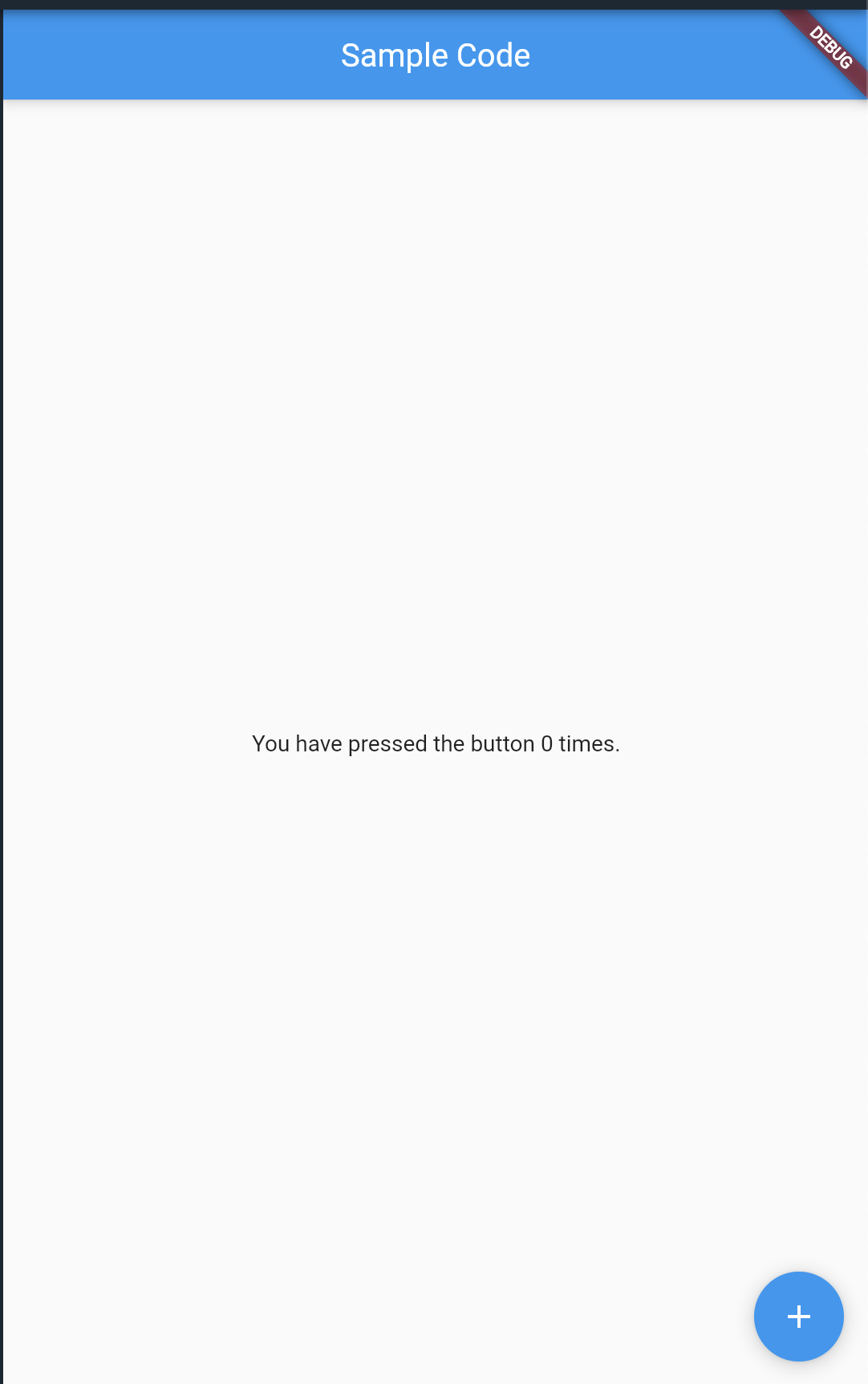
위의 코드를 다시보면 (아래에서 7번째 줄)
오른쪽 하단의 Floating Action Button에 onPressed 에 count를 증가시키는 내용을 작성했었습니다.
그래서 오른쪽 하단의 버튼을 누를 때마다
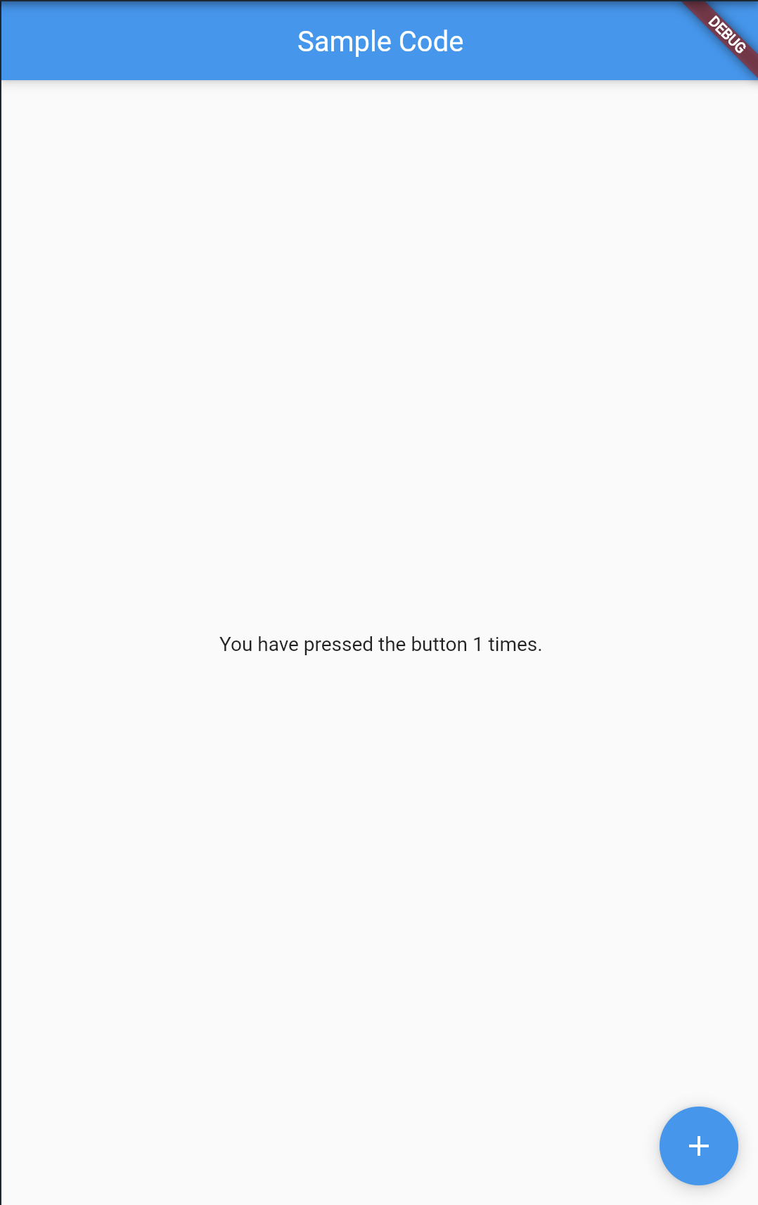
body의 text 부분의 count가 증가하는 것을 볼 수 있습니다.
지금까지 scaffold를 다루는 간단한 예제를 해보았습니다.
추가적인 내용이나 디테일한 부분을 더할게 있다면 추후에 수정하도록 하겠습니다 :)